Thursday, 27 November 2014

Record, Respond, Remake

The second project started with an object from Poundland. We had to analyse the purpose and function of the object, as well as the aesthetic, texture, and any other qualities we thought relevant or interesting.

My object, a packet of plasters, was my starting point. I spent time thinking over what meaning we ascribe plasters. Why is it we associate them inherently with childhood? Why are more plasters flesh tone as you grow older? Why are we ashamed of showing that we have a minor injury, when we know that there is no harsh judgement for a paper cut?
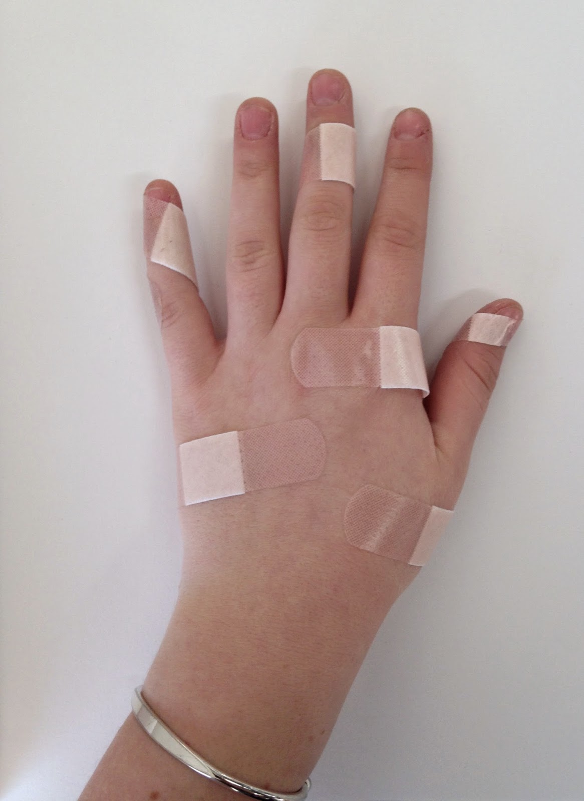


From the hand with plasters on it, I progressed onto the idea of a hand made out of plasters. To practise this, I made a small hand. This was hilarious, and I am glad that I made it, as it gave me an accurate prediction of how many plasters can be used to cover how much space.


After constructing this, I decided to make a perfectly scale plaster hand with the assistant of a patient friend.


The hand was photographed in a variety of positions as an attempt to experiment with different perceptions. I do wish that I could have involved a few more props and settings, however I had limited time and I am still incredibly pleased with the results of the experiments I managed to get done.

Because I liked the warm glow created by the lit up hand so much, I decided to keep it illuminated. I thought that this made the design a lot less 'creepy', as it had been pointed out to me multiple times how disturbing it was to see a hand with an 'off-flesh-but-near-enough' tone.


The above image is my final design - I researched average heights across the UK - if it stands at 5"6 it should be in the eyeline of the most adults as possible. The hand would be illuminated at the base, and provide the only light in the room in which it would be displayed. 

I think that the final result is both unsettling and charming at the same time. I don't believe I would change anything if I revisited this project, as I feel it was an interesting challenge to take on, involving completely new ideas and an unusual material.

Fixtures and Fittings

The first project of the 3D Design pathway started off with a cardboard box of fixtures; zip-ties, tape, wire, balsa wood, plastic, and cardboard. Then, the instructions to create 10 shapes.


These images show the first set of structures I created without thought. I immensely enjoyed this process. The next stage I took was to consider what each piece might mean, and how I could develop these ideas further.


These are refined versions of earlier pieces. I took themes I could see and attempted to make them far more obvious; family, flight, orbit, freedom. I noticed that all these new creations were suspended from above.

Then, I found a material in a box that had been delivered to my house - a lightweight plastic wrap, slightly spongey to the touch, and smooth. It was so light that it drifted softly and I found this very calming.

After looking at research into structures built like the ArcelorMittal Orbit, Seth Goldstein's calming sculptures, and the series of individual works by Allan Mccollum, I decided that I would use this material to create an installation in order to perpetuate a feeling of calm.


The installation would be a cubic room, featuring the packaging plastic hanging down in strands of different length. In the centre there would be a spiral staircase, that people could step up or down to be in the strands as they wanted.

Whilst I am pleased with the aesthetics of the final concept, I am not happy with the fact that anybody who can't climb stairs would not then be able to experience the installation to the full.

To rectify this, I considered removing the staircase, and have completed a few sketches of alternative shapes to the plastic. The best alternative I have found would be to cover the entire of the ceiling, ranging from long to short, so that you can walk from one end of the room to the other and back again. Whilst I am not sure this would solve all of my problems, it is definitely an avenue I would pursue if given extra time on this project.

Tuesday, 7 October 2014

Graphics: Part 2

After missing a morning due to an appointment, I tagged along with a group activity for the afternoon that involved creating a product or franchise, and completing a presentation to show the rest of the class. Unfortunately, as I spent the whole afternoon catching up on the morning, I have very little show for what time I was in, especially as the majority of contributions that I made were verbal.

However, on the final day of our graphics rotation, we were set the task to create 6 15x15cm square designs, in order to represent better who we were. These designs found their creating roots in the 10 pages of preparatory 'doodles' and 'not-scribbles-but-still-kind-of-random-designs' we had to complete for homework.

Obviously this meant that I revisited a few of the conclusions I had drawn earlier in the rotations in which we had to ask ourselves the questions of 'who am I?' 'what does that mean?'. As I had already concluded that I am expressed best by showing what I love, I started by drawing my surroundings and working outwards and into relationships, and far more conceptual designs.


Above are a selection of the pages from which I drew my 6 designs, and below are the more refined plans I made for the 6 squares.


Whilst I experimented with various colours and sizes, I decided that the blue pen I had was not only a lovely colour, but by using it for all the squares presented them as a matching set far better than the content could. To draw each in a minimalist style effectively required me to use pencil to sketch in and measure exactly where I wanted each feature to sit - the sketching actually added a good sense of depth to the otherwise light and thin blue marks, and so I decided not to erase any of my planning whatsoever.

I feel that whilst this adds to the aesthetic, its also interesting to see how I worked - using the pencil sketches it is possible to trace back to how I lay each square out, which adds another type of depth beyond the 'visual' to each square, as the entire process is revealed.


The above photograph is not as clear as I had hoped when it was taken, however it shows all of my completed squares on display how they are intended. I put a lot of thought into how the diagonal, horizontal, and vertical elements of each square would sit together in order to create a neat, balanced layout.

Sunday, 5 October 2014

Graphics: Part 1

The first day was spent with the aim to create a collage using a photo we had to bring in of ourselves.


However, before we created the collage, we were put into groups of four and instructed to draw one another, then ourselves, only with varying conditions. Those being with our eyes closed (after staring at them for a full minute), with our weaker hand, then with our mouths. Lastly, a self portrait completed without using any pictures nor reflective surfaces for reference.

As someone who created a rather accurate self portrait, I felt rather vain.


We then had to draw a picture of someone's ear. We put all of our drawings on the ground before returning upstairs and taking a photograph of all of them together.


In the afternoon however, we got on with creating the main product of the day; the collage. After photocopying and enlarging my image, I made it black and white, and produced yet another copy in green. I decided to stick with the theme of green and black and white - if not for the rather trivial reason that having dyed my hair green I am rather restricted to the colourless items of my wardrobe.


 Besides the use of our face, it was also required that we included at least one word of text - I used cuttings of a photocopy of an issue of french Vogue from 2007 using the words 'de la vérité'.

I find the image rather interesting, simply observing it as a product with little to no plan, but the result of letting my hands get on with cutting things up, sticking things down, resizing and then considering the tones of grey - completed mostly in a state of autopilot after a large lunch.

The bright tone of the green certainly adds a depth to the piece, and it is rather engaging.

It is also reminiscent of perhaps computer coding; black and green.

I don't know that I would change anything had I the chance to repeat the day. I might try to find a darker or plainer background for the selfie I used, however the spontaneity of the task prevented me from considering the picture too much. Why put excess effort into staging something that mightn't be used? Then again, I had every opportunity to manually cut out the background and replace it with a darker image, and didn't.

The day was spent exploring where my instincts could take me with these images.


Graphics: Research

Before commencing with the week of graphics, we were set the task to do some research in preparation. This included a trip to Waterloo station (to view the plethora of graphics on display), the Welcome Collection's exhibit on the 'Idiosyncratic A-Z of the Human Condition', and a display of film posters done by Hans Hillmann. A trip to visit the Malevich exhibition at the Tate Modern was also suggested, however I was restricted to the former three as they required no additional funding beyond the means to travel.


The idiosyncratic A-Z was a very interesting
exhibition, mostly because it was interactive
in a way that appealed to the user by skipping
instantly from the mundane to the most
profoundly private parts of who you consider
yourself to be.

Fulfilling the tasks, such as writing and discarding
your fears, drawing a self-portrait, or marking
your height on a wall, all proved to make you
consider yourself in a new way, be it a thought
you've never had, or a comparison you've never
had such an explicit chance to make.


Then, the gallery of film posters was a sharp contrast from the introspective to the minimalist advertisements. I very much liked the block colours, the line work, and the careful consideration with which the subjects of the posters had obviously been chosen. It's certainly not the first time I've given serious thought into minimalism - the idea of something intensely simple communicating an entire story or complex message is very personally appealing.


Saturday, 4 October 2014

3D: Spaghetti and glue

The final day of our 3D rotation was spent wrestling with a very unusual and uncooperative material; spaghetti. The task was to create a structure able to support 3 plastic balls above the ground.

In the spirit of efficiency I decided that I would get something done using as few strands of spaghetti as physically possible. After 15 minutes, I realised that this would be possible yet exceedingly boring. I then adorned my frame with extra strands.


This final structure was not terribly large, however it comfortably held the weight if the three plastic balls it was designed to hold. It could have held a fourth, but it would need to be balanced awkwardly atop two others, and did not suit the structure.


Here it is fulfilling its purpose.

We then were tasked with covering this structure with paper as an attempt to protect the structure from a basketball.


As with every single other structure in the class, mine got totally wrecked. If I had the chance to revisit the task I would work an awful lot faster, as I think it would have at least remained somewhat recognisable if I'd had more time to work.

However I thoroughly enjoyed putting thought into designing the structures I could make, as well as considering the designs that my classmates came up with, as there was a huge difference between each individuals work that when considered, gave me a fresh perspective with which to view my own designs.


I found it particularly interesting how most if us considered our own designs to be the 'obvious' idea, despite the variety we created.

As it stands I feel that I did in fact go for a fairly obvious structure, and hope to continue my work by developing more ways of challenging and stretching myself in my designs and products.